
I think one of the most exciting parts of making a new quilt is choosing the fabrics!
In my experience, the process of choosing fabrics has been different for every single quilt. Sometimes there is a fabric bundle I fell in love with that’s a no-brainer. Other times, there are certain colours I know that I want to use. Sometimes, it’s more of a textured look that I’m going for.
And then sometimes, I can get really stuck and it takes me a long time to decide which fabrics I want to use! I’m sure you’ve been there - you want the look and feel to be just right!

One thing I like to do when I’m stuck is to create a Pinterest board! It’s the perfect way to be inspired by colour palettes and combinations that can then translate to your fabric choices!
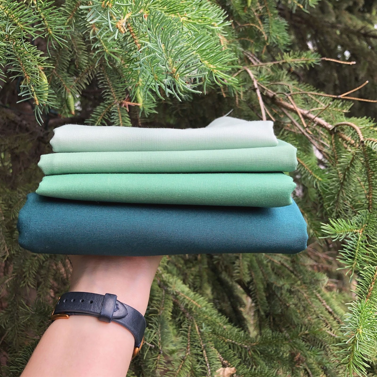
Another good place to start is to decide how many colours you want (or need).
When I designed the Landmark Quilt Pattern, I wanted to provide multiple colour options! It can be made as a six-colour quilt, two-colour quilt or with fat quarters/scraps.
So, I will be using Landmark as our example quilt throughout this blog post!
Six-Colour Quilts
For my Landmark cover quilt, I went with Windsor, Dresden Blue, Salmon and Peach Kona Cotton set on a Kona Black background.
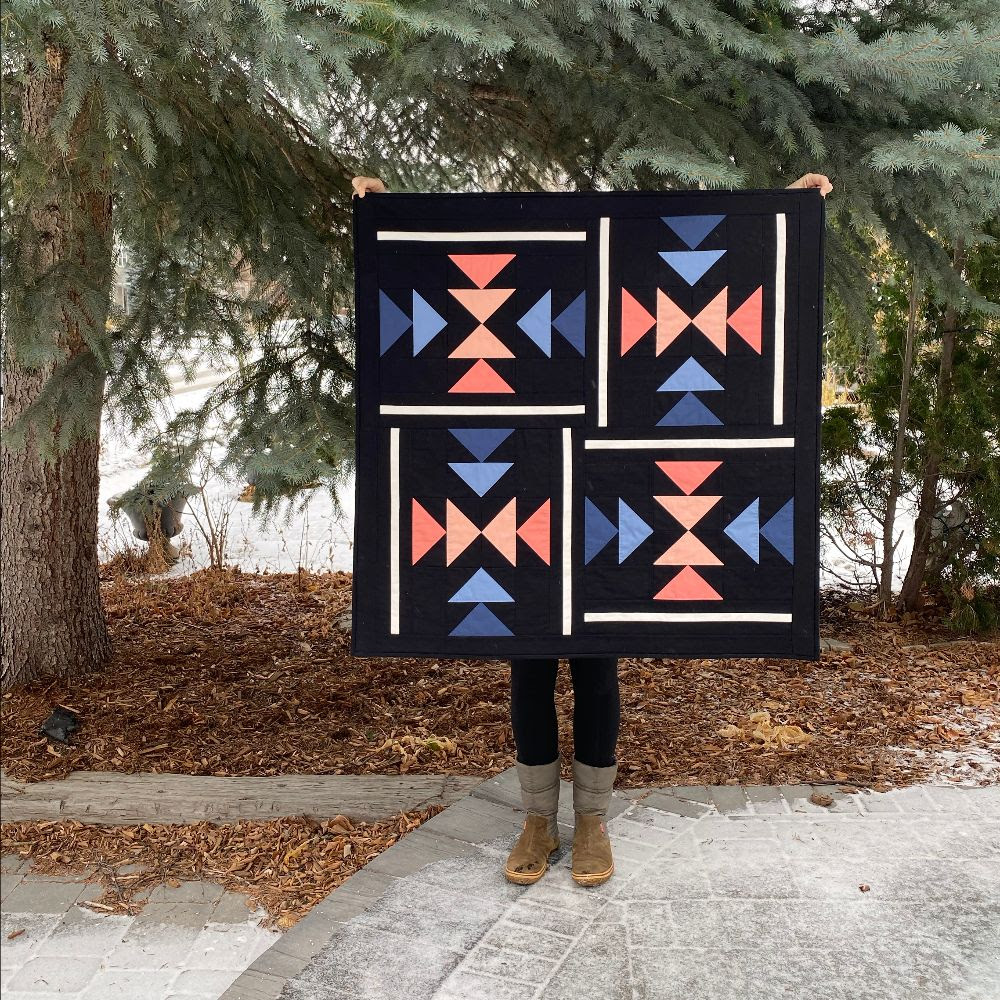
A very common fabric choice in quilting is to mix or pair warm colours with cool colours to create contrast, and that’s exactly what I did with this quilt!
First, I chose one of my favourite shades of peach as a starting point (aka my “warm” colour). Then I chose the deeper blue as my cool colour. Even though I could have picked four different coloured fabrics for the flying geese, I wanted this quilt to have a more peaceful, calming vibe. So, I decided to use a lighter shade of each of the fabrics I had already selected.

My next choice was the background fabric. I took all of my fabrics for the flying geese and lay them down on both white and black fabric to see how they made me feel.
To be honest, I’m not exactly sure HOW colours make me feel things, but they do! I usually have a pretty strong gut feeling. It’s almost as if the fabrics are speaking to me or ASKING to be together. In this case, I really felt like the black background made the blues and peaches shine!
Then, I made a Landmark Quilt using only fabrics from the stunning Luna and Laurel collection from Art Gallery Fabrics!
It’s a great idea to work within one fabric line for your quilt. With almost every fabric line on the market, you can feel confident that any of the fabrics within the line will work nicely with each other! This is because the designer intentionally chooses complementary colours and prints. Doing this is a great way to experiment with new colour combinations, since someone else has done some of the hard work for you!

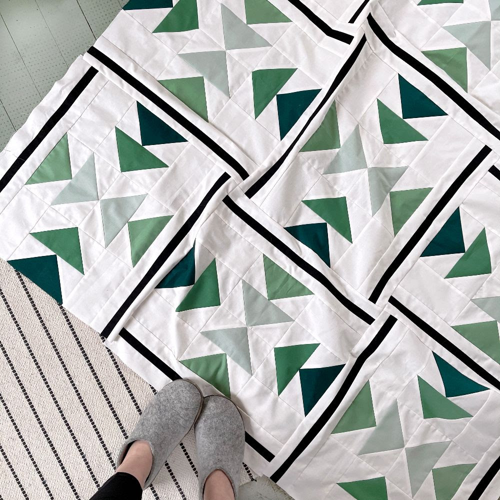
I enjoy seeing how the same fabrics can look unique and different when used in different patterns.
And as a bonus, after you have made a few quilts with the same fabrics, you start to feel like you have a curated quilt collection...and that just feels fancy!
I also made this one for the Landmark Quilt-A-Long using Golden Hour by Alexia Marcelle Abegg for Ruby Star Society. I love this one a lot!

This quilt was a chance to push myself out of my comfort zone! I love love love this fabric line, and am always inspired by Alexia’s work. However, these are not at all my go-to colours!

I’m so happy that I made the choice to work outside of my comfort zone. Doing this will really expand your creativity and thinking around colour!
Fabric Placement For Six-Colour Quilts
One thing you may notice is that I chose to place my fabrics in similar pairs of flying geese.
Using my cover version as an example, I placed two shades of blue fading from dark (more saturated) to light (less saturated) together. I repeated a similar style for the peach fabric on the opposite flying geese.
This creates subtle movement within the quilt’s overall design and makes it pleasing to the eye.

I also used high contrast between the strip pieces on the outer edges of the block to create definition. If you’re struggling to know how to place your fabrics, this is always a good starting point!

Two Colour Quilts
For anyone who prefers a clean aesthetic or has trouble choosing multiple colours, a two-colour quilt may be a great choice for you!
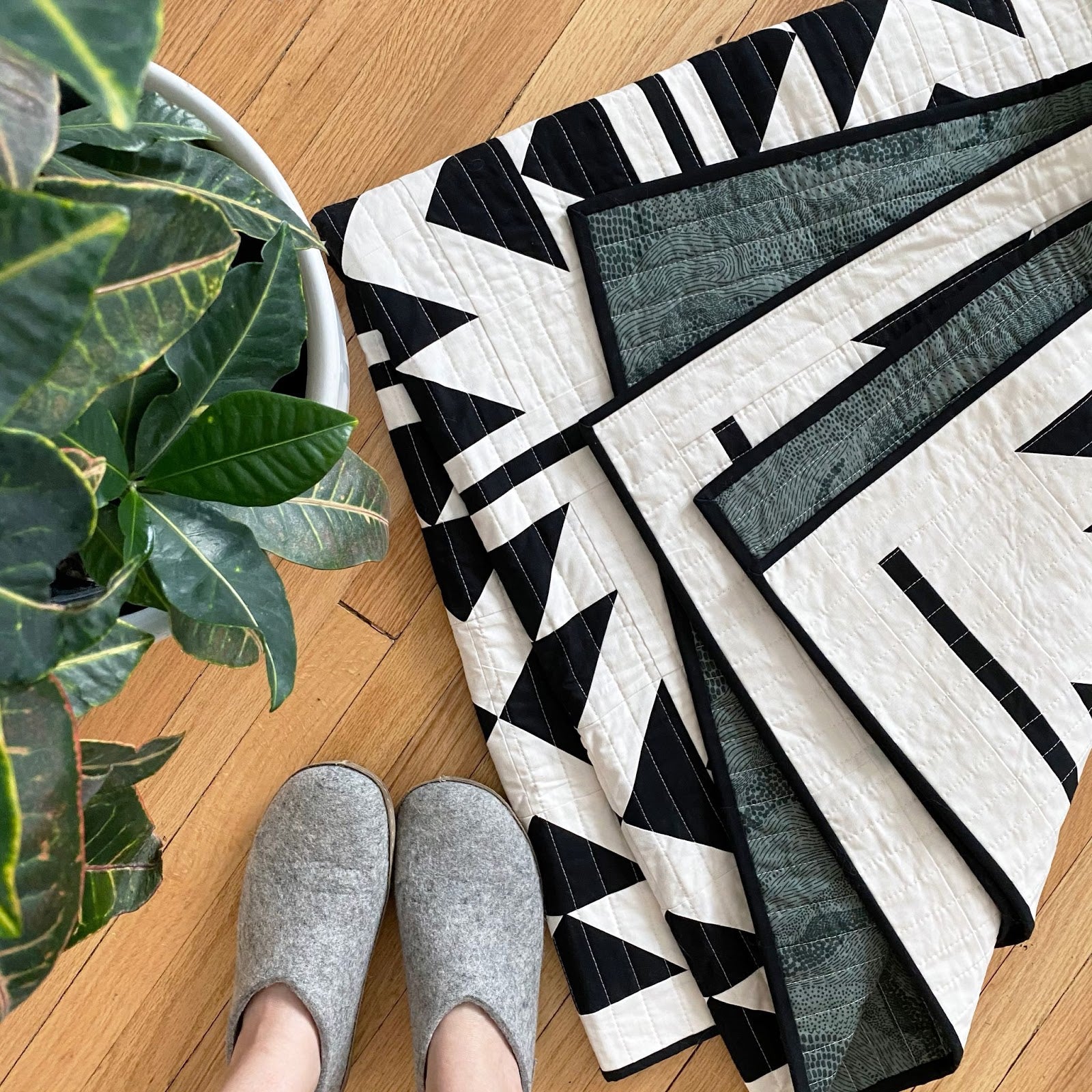
This natural and black two-colour quilt is definitely one of my favourites! It creates a simple, modern and geometric design.

You could choose to do a high contrast combination like I did (black and white), or even do a subtle low contrast/volume quilt.
Any sports fans out there? A two-colour quilt is often the perfect chance to use your favourite team’s two main colours! White and blue for a Winnipeg Jets fan, maybe?
Fat Quarters
When using fat quarters for the Landmark Pattern specifically, you have the option to group the flying geese made from one fabric all together, or you can spread them out throughout the quilt! It all depends on the final look you’re trying to achieve.
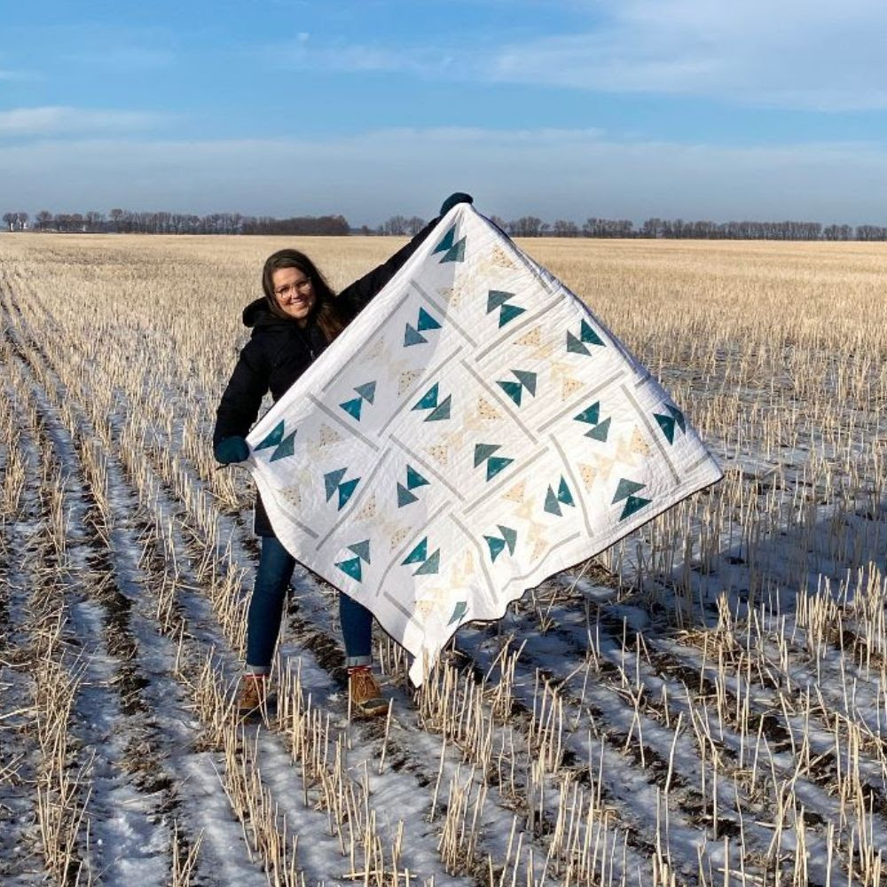
I made this Christmas quilt with a Flurry Fat Quarter Bundle from Ruby Star Society. I opted to place similar colours in the same positions within the blocks for a cohesive look, but each block is a variation of different fabrics.

Fat quarters are often purchased in curated bundles from a fabric shop, or a bundle of one fabric line! Again, this is a great starting point when choosing colours for a quilt because you already know they will look great together!

But...I have an idea for you. Start paying attention to those bundles! Start noticing what it is that you like or don’t like within the bundles. Is it that they are made up of similar colours, or perhaps high contrast fabrics? Maybe the bundles you’re drawn to have a rainbow or ombre flow to them. Perhaps they are soft muted colours or bright, vibrant colours?
Once you start noticing WHAT it is that you like in curated bundles, you’ll be in a great place to start curating your own fabric pulls!
Scrappy Quilts
I will be the first to admit that scrappy quilts are not my area of expertise!
I ADORE scrappy quilts! I love seeing them in person, and they often stop me mid-scroll on social media. However, I don’t feel as though I have mastered the art of them myself.
Just like any quilter, I have a lot of scraps lying around from previous projects and I have a strong desire to use them! Any time I do anything so-called “scrappy”, it does tend to still look very curated and intentional in the end!
I created this rainbow Landmark mini block with scraps! I grabbed random scraps from previous quilts for each of the flying geese.

For the Landmark Pattern, the No-Waste Flying Geese method is used. This means that you will end up with FOUR identical flying geese, which gives you options on how you place the flying geese within your blocks.
You can go “truly scrappy” and sew your blocks together as you go!
Or, if you’re a bit more of a planner like I am - once you have all of your flying geese made, lay them out (on the floor, on a table or on a design wall) until you have a layout you are pleased with!

Directional Fabric and Prints
Another thing to keep in mind is whether or not to use directional fabric.
For example, directional fabric may not necessarily be your friend with the Landmark Pattern, but this isn’t necessarily true for all quilt patterns. I know myself and many other quilt pattern designers will try to make a note in the pattern if directional fabric is something to consider!
As I mentioned earlier, the Landmark Pattern involves making four No-Waste Flying Geese at the same time. Add in a rotating quilt block in the final construction and it’s virtually impossible to keep all of those directional fabrics facing the same way!
But if you love puzzles, directional fabric could be fun for you in this case!
With all of that being said, the scrappy Christmas Landmark Quilt I made uses directional fabric and...you guessed it! Those fabrics are pointing up, down and all around. So, if you don’t mind that, neither does the quilt!

Another thing to consider when working with prints is scale! This specifically means how big or small the print is.
Typically speaking, a smaller scale print may be better suited for smaller pieces and vice versa. But there are always exceptions, of course! There are a lot of factors to consider including how busy a print is, how many colours are in the print with how much contrast, etc.
Using the Christmas one as an example again - the strip sets that are on the outer edges of each block are quite skinny strips, which may be better suited for a smaller print.

However, I would never want to hold you back! Sometimes very interesting and abstract designs emerge when you slice up a large scale print!
Isn’t that one of the joys of quilting? SO many options!
Colouring Sheets
Are you a visual person like I am? I can imagine a lot of things in my head, but there’s nothing like actually seeing it come to life!
That’s why all of my patterns have colouring sheets included! You can play around with different colours and placement before you commit to any fabric choices.
Print one (or 5) and have some fun!
Lastly, here are a few more mockups that might help inspire your fabric choices!

 These are Terrakotta from Art Gallery Fabrics, Perennial by Sarah Golden and Rifle Paper Co. Basics.
I hope this helps! But please remember - at the end of the day, your fabric choices should be whatever feels best for YOU!
Have questions? Please reach out to hello@theblanketstatement.ca and we’ll help you out!